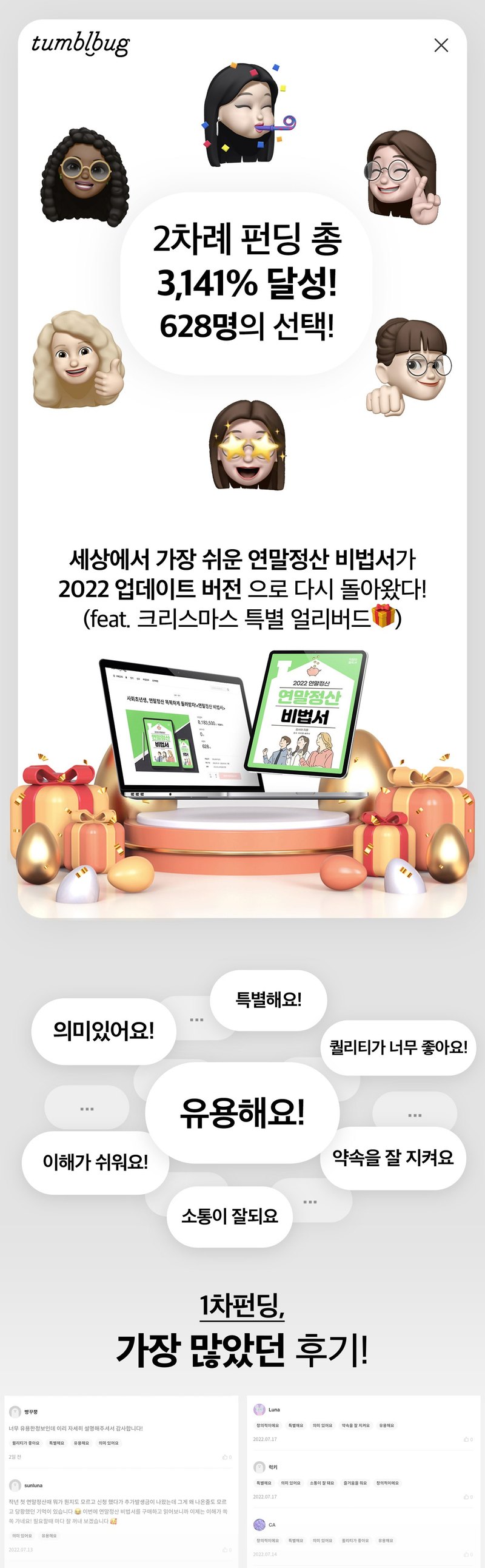
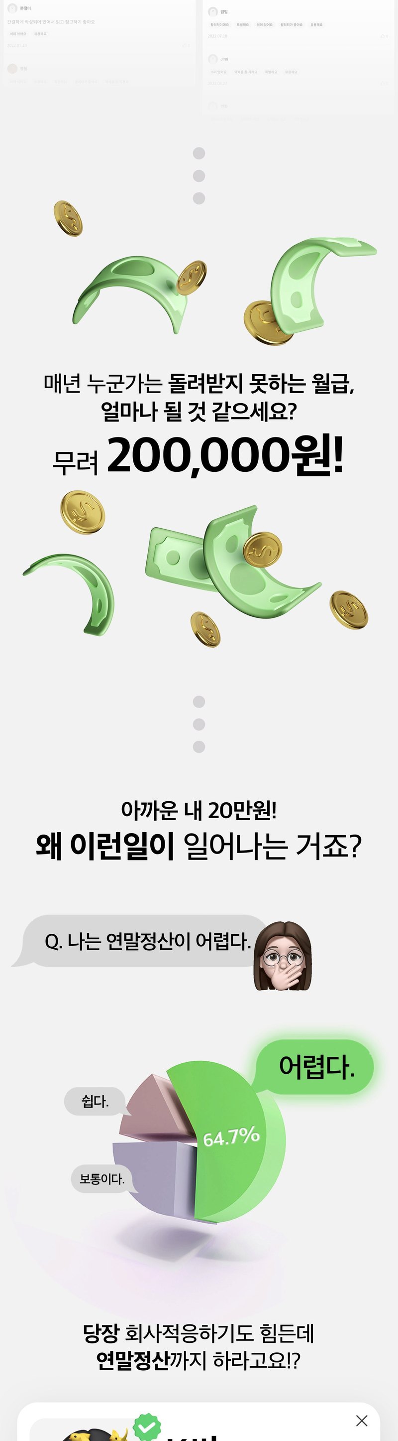
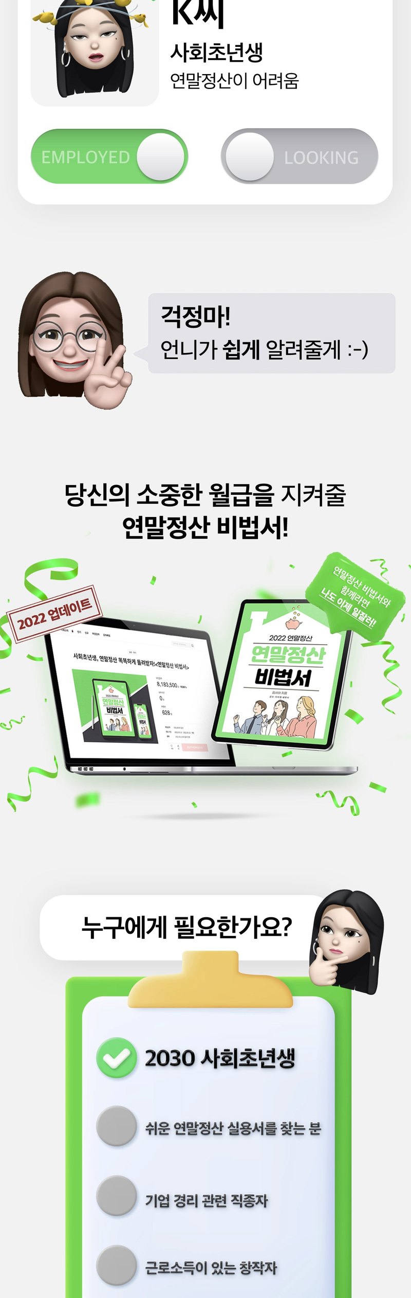
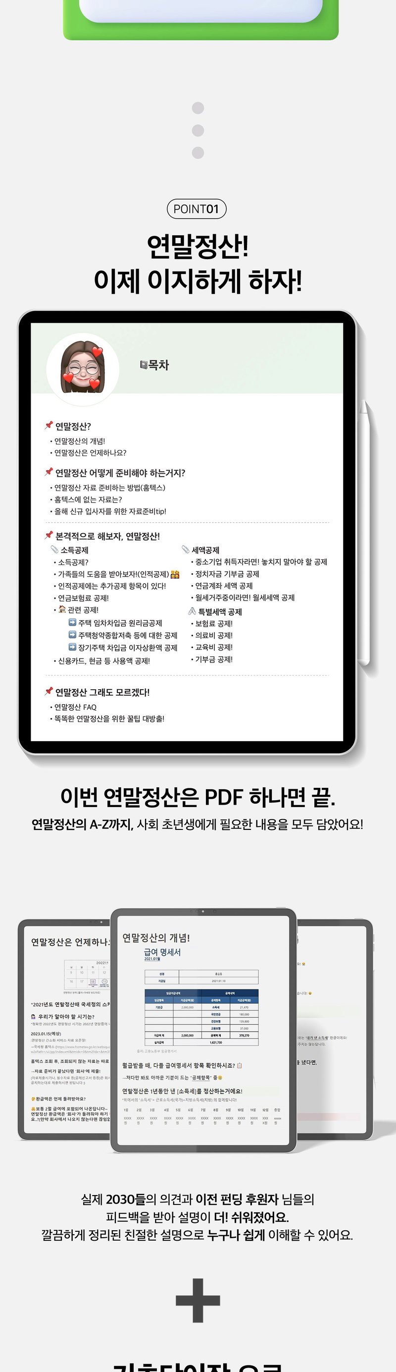
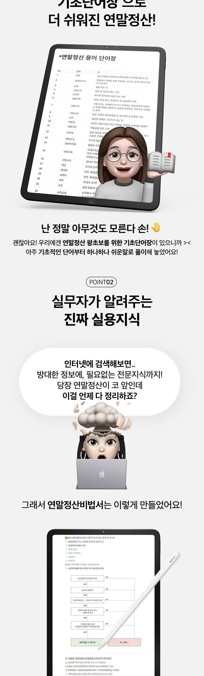
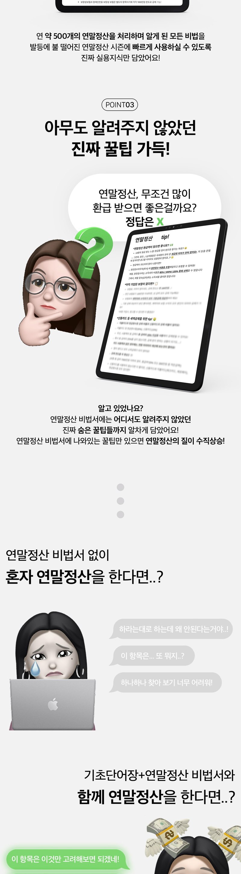
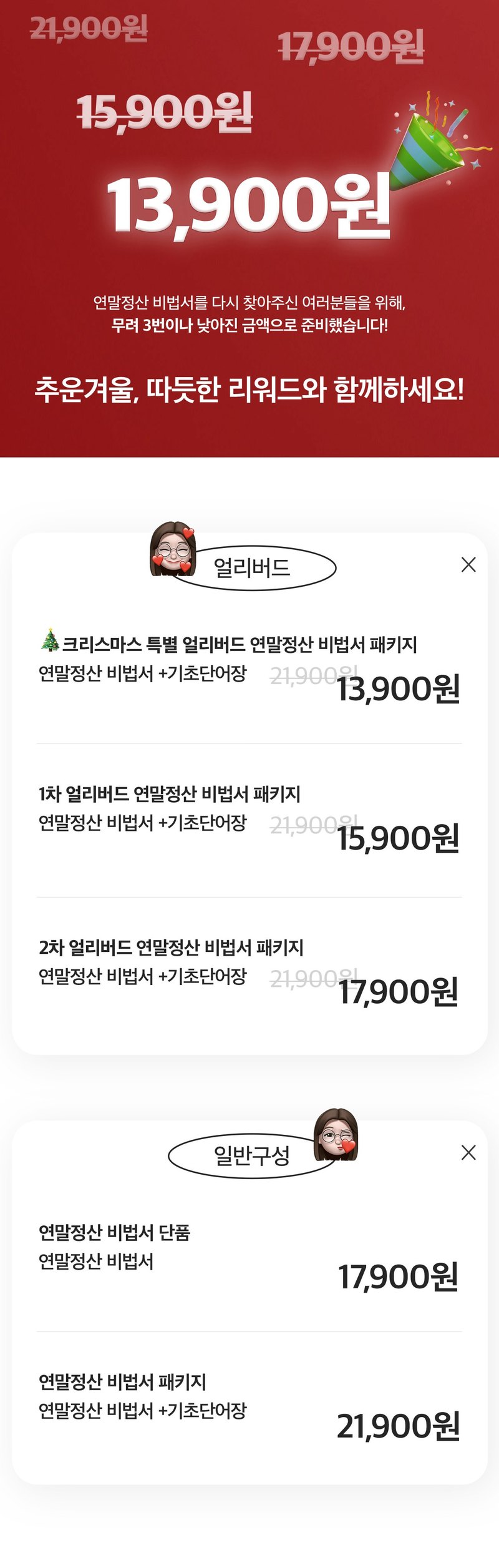
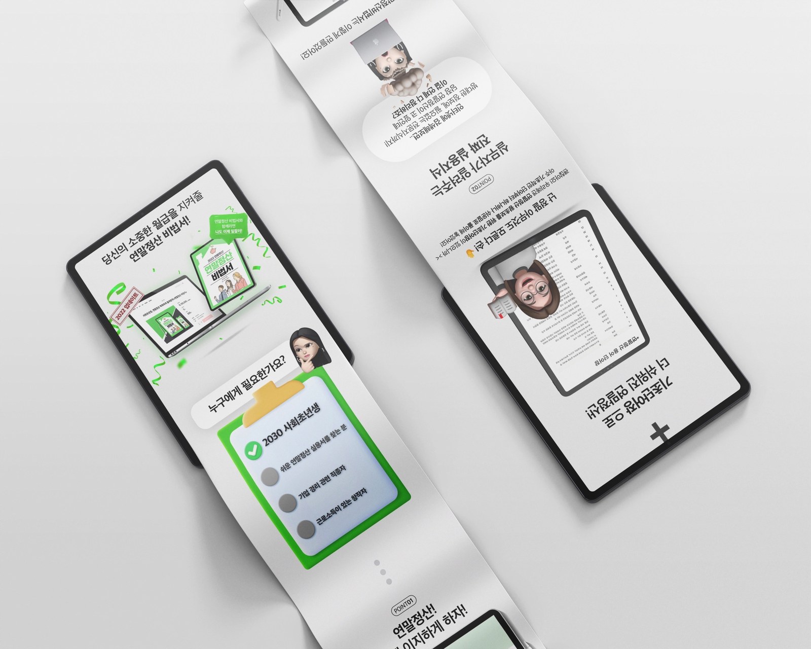
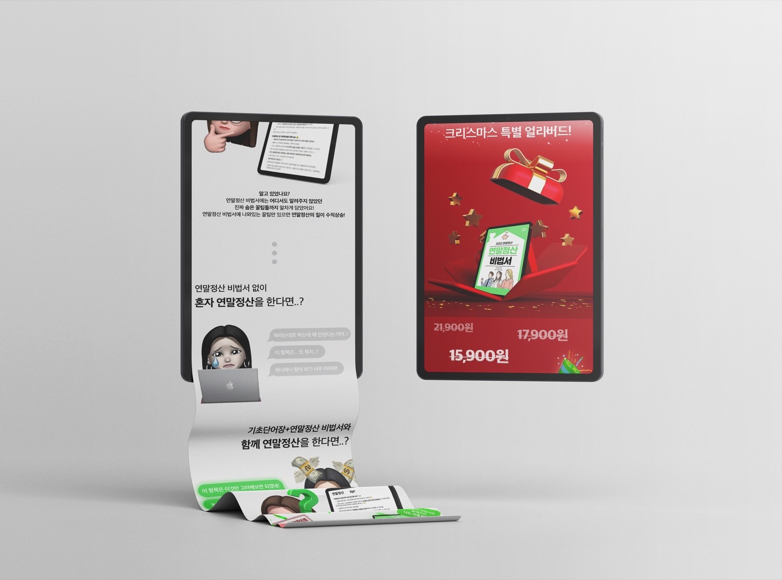
연말정산 비법서 Ver.2의 펀딩 상세페이지를 기획하고 디자인했습니다. 책을 처음 접하는 독자가 내용과 난이도를 살펴볼 수 있도록, 설문과 목차, 용어 풀이와 내지 예시를 순서대로 배치했습니다. I planned and designed the campaign page for Year-End Tax Guide Ver.2. Surveys, contents, terminology and sample pages give first-time readers a preview of the book's scope and difficulty.
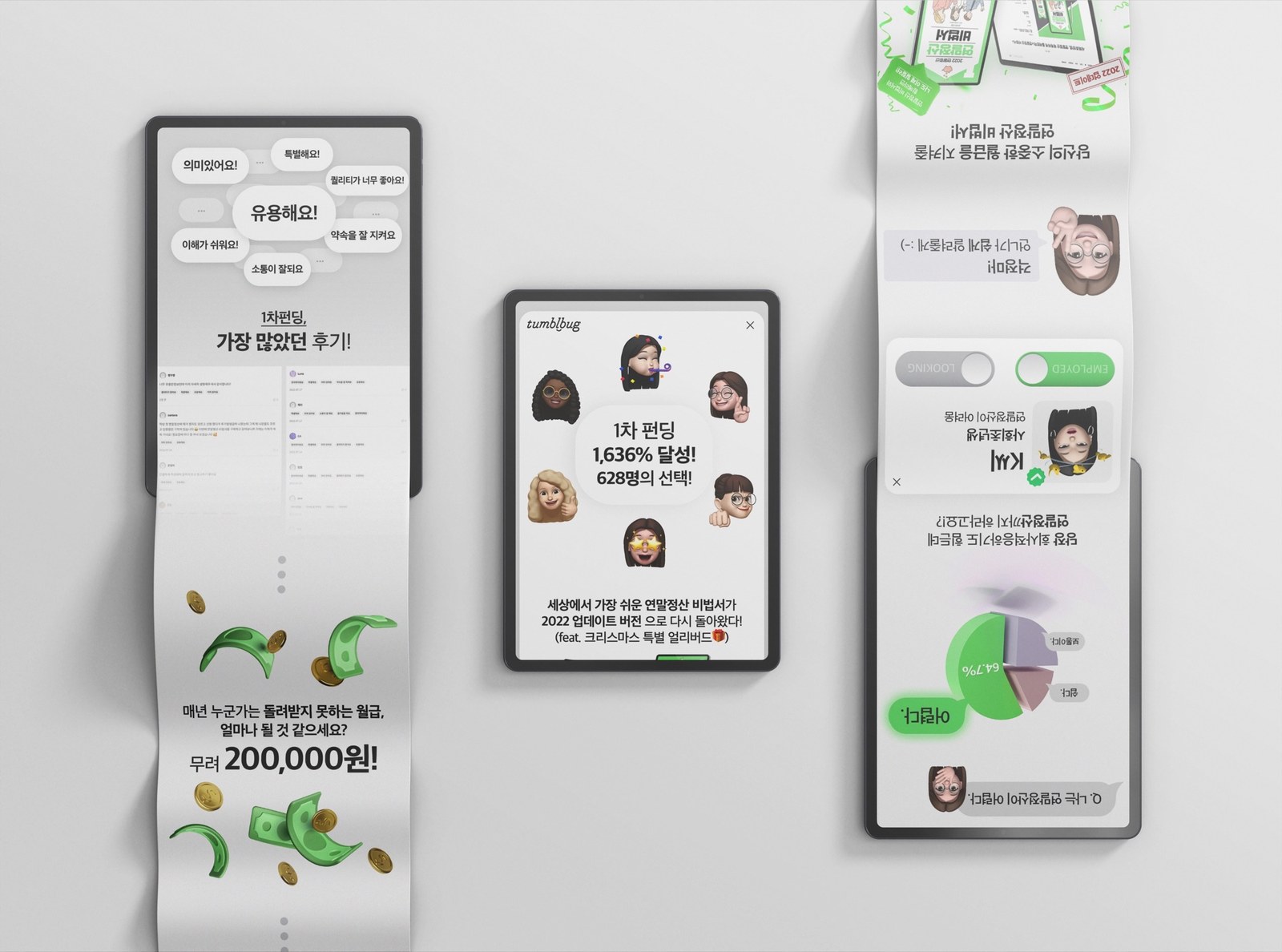
이전 펀딩 소개에서 독자의 고민으로 이어지고, 목차·본문 예시·리워드를 차례로 보여줍니다. The page moves from earlier campaign information to reader questions, contents, sample pages and rewards.
이전 펀딩 기록과 독자 후기를 먼저 소개했습니다. 목차와 내지 예시는 별도 구간에 배치해 책의 내용을 살펴볼 수 있게 했습니다. Earlier campaign records and reviews introduce the project. Contents and sample pages appear in a separate section to preview the book.
상세페이지에 소개한 기존 펀딩 기록입니다.An earlier campaign figure presented on the detail page.
기존 후원자 수를 프로젝트 소개와 함께 보여줬습니다.The earlier backer count accompanies the project introduction.
Ver.2의 내용을 기존 펀딩 소개와 구분했습니다.Ver.2 content is separated from the earlier campaign introduction.
목차와 내지로 후원 전에 책의 구성을 살펴볼 수 있게 했습니다.The contents and sample pages preview the book before backing.
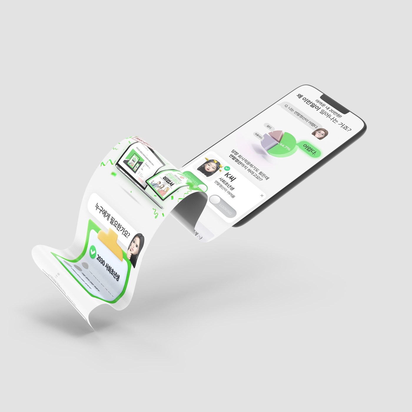
세무 용어 설명에 앞서 독자 설문과 질문을 배치했습니다. 책에서 다루는 고민이 무엇인지 먼저 보여주려 했습니다. Reader surveys and questions precede the tax terminology, introducing the questions the book addresses.
책 설명을 시작하기 전에 독자의 상황을 짧은 질문으로 제시했습니다.Short questions establish the reader's situation before introducing the book.
설문 수치와 해당 질문을 함께 배치했습니다.Survey figures appear alongside the relevant questions.
질문과 설명을 말풍선과 카드로 구분했습니다.Speech bubbles and cards distinguish questions from explanations.
용어 풀이와 홈택스 안내 내지를 보여줬습니다. 제목만 나열하지 않고 책이 어떻게 설명하는지 살펴볼 수 있게 했습니다. Glossary and filing-guide pages preview how the book explains its topics, beyond a list of headings.
용어와 설명이 함께 보이도록 내지 이미지를 배치했습니다.Sample pages show terms alongside their explanations.
화면 캡처가 들어간 본문 예시를 보여줬습니다.The preview includes pages with filing-interface screenshots.
서류 안내가 정리된 내지를 별도 구간으로 보여줬습니다.Pages with document checklists appear in a separate section.
책을 활용하는 상황과 수록 내용을 비교해 보여줬습니다. 긴 설명을 나눠 읽을 수 있도록 같은 형식의 구간으로 정리했습니다. Matching sections compare situations in which the book is used and the topics it covers, breaking up longer descriptions.
짙은 네이비와 밝은 바탕을 구분하고, 옐로와 민트를 수치와 강조 구간에 사용했습니다. Navy and pale backgrounds distinguish sections, with yellow and mint highlighting figures and key points.