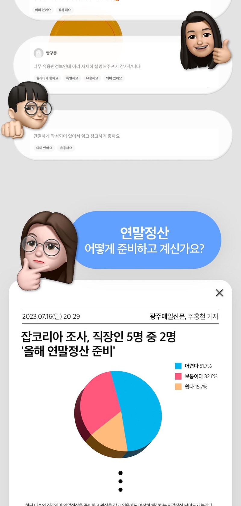
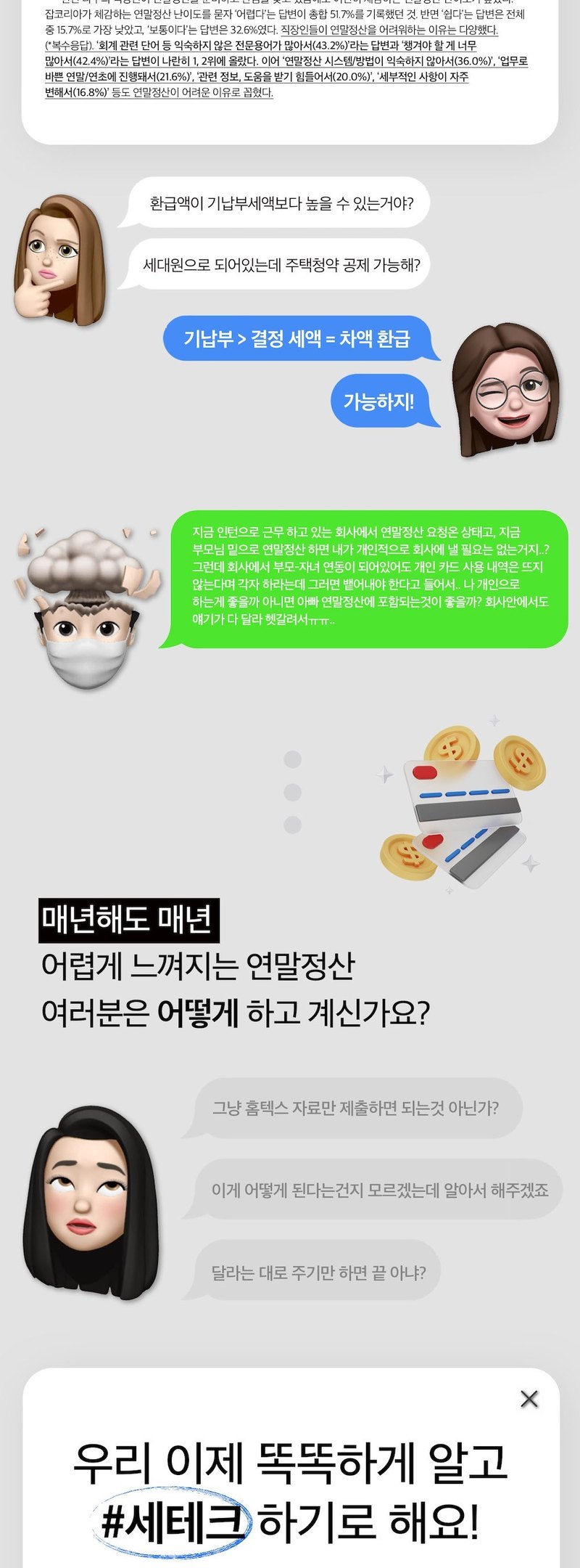
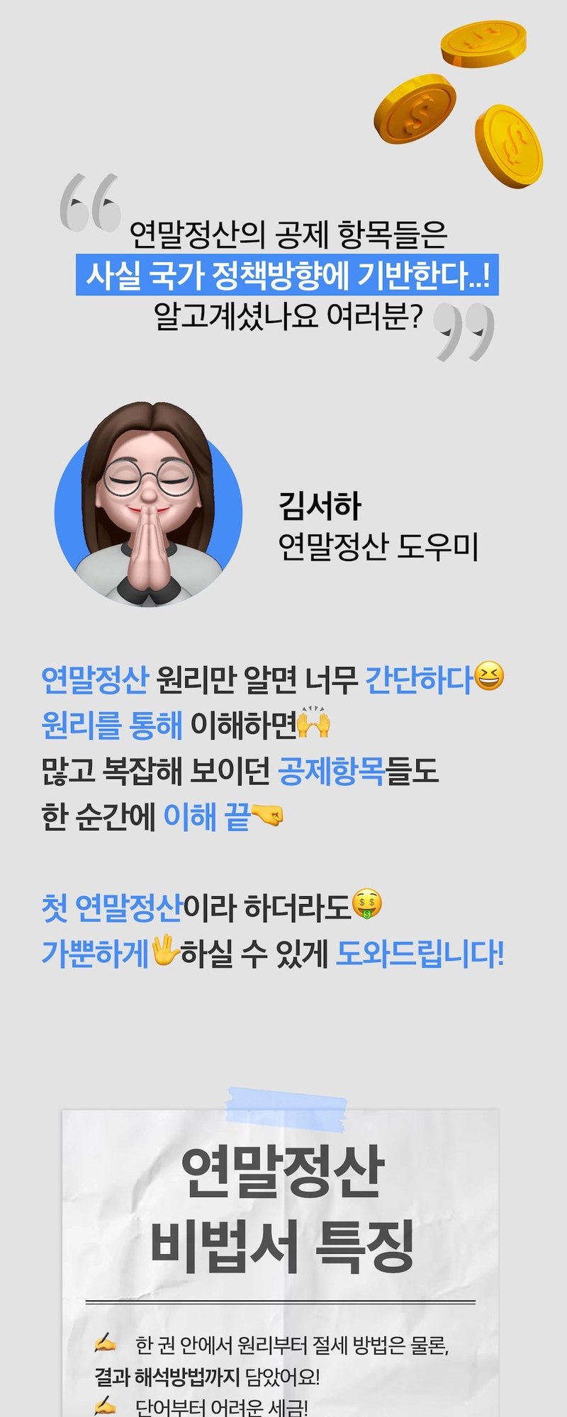
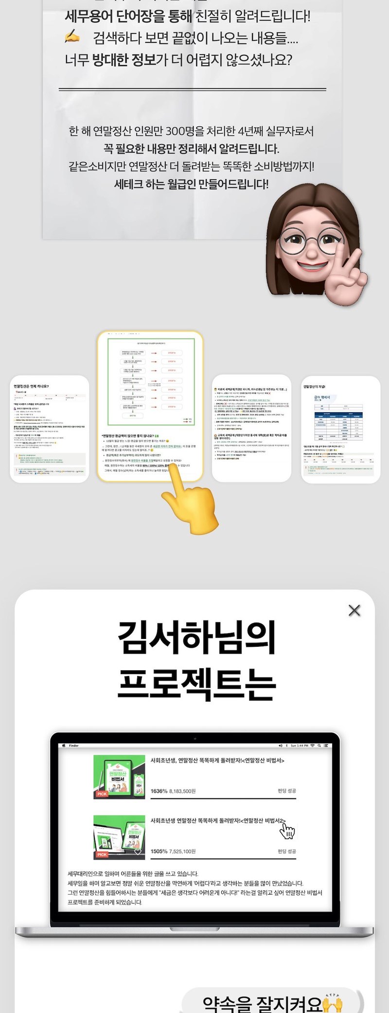
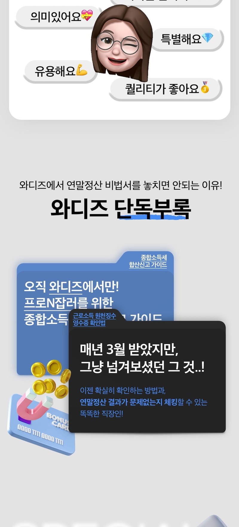
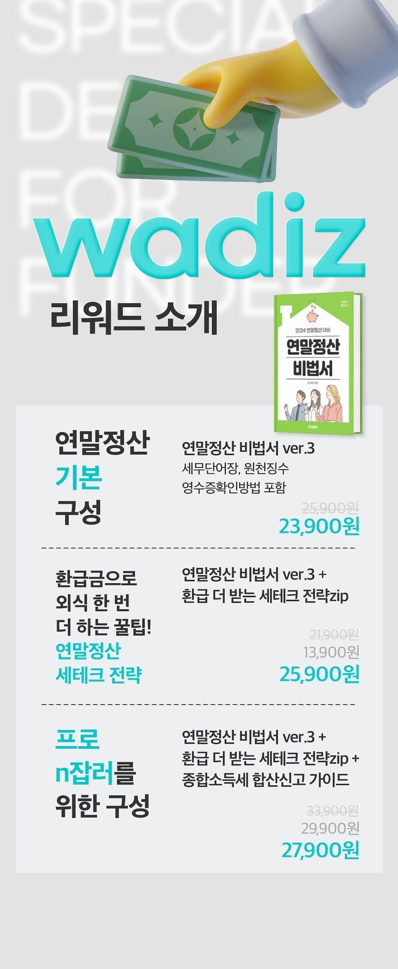
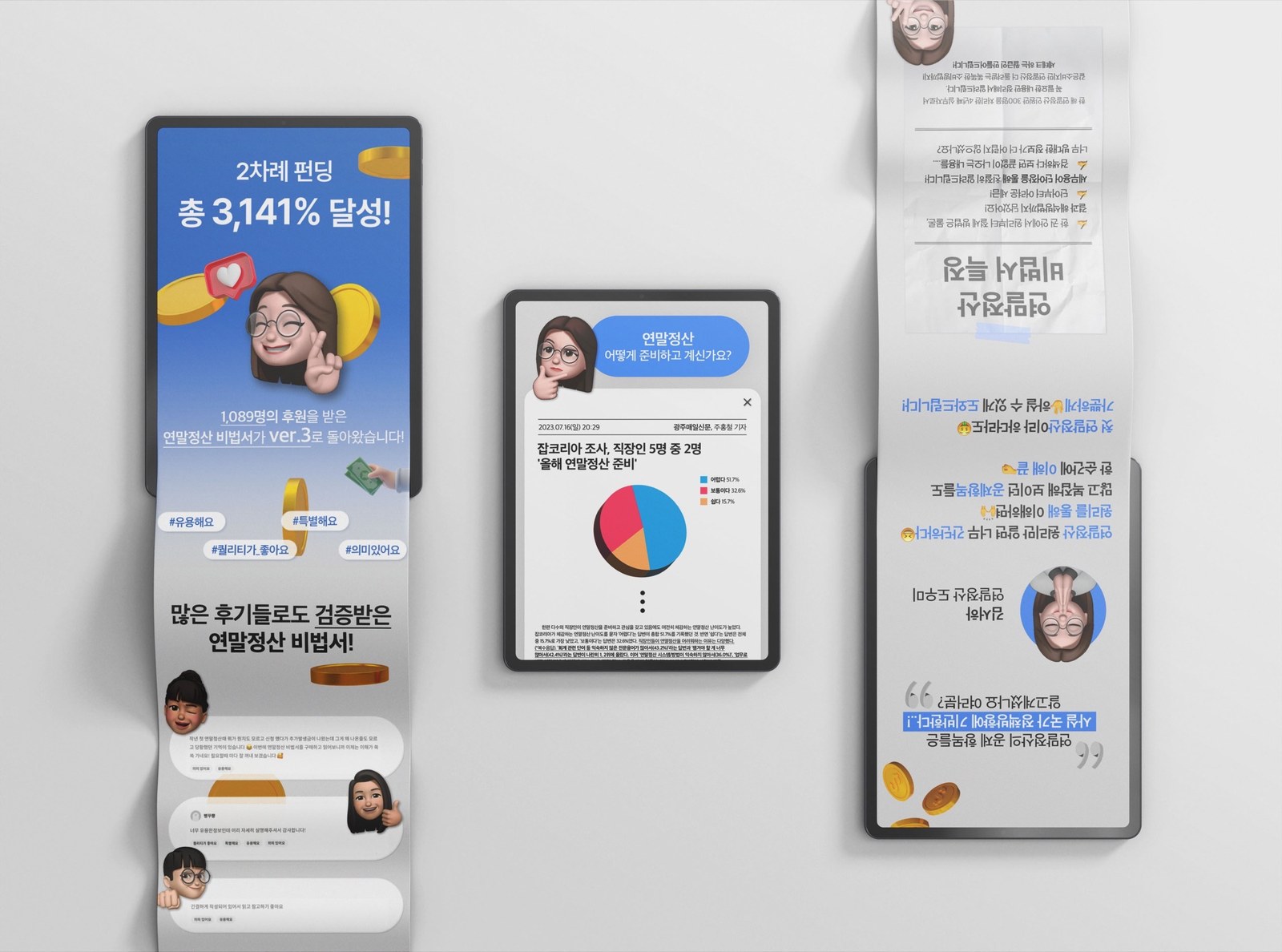
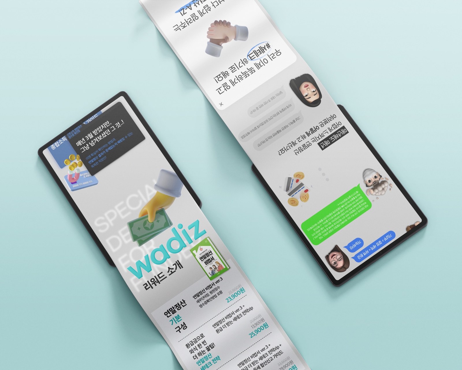
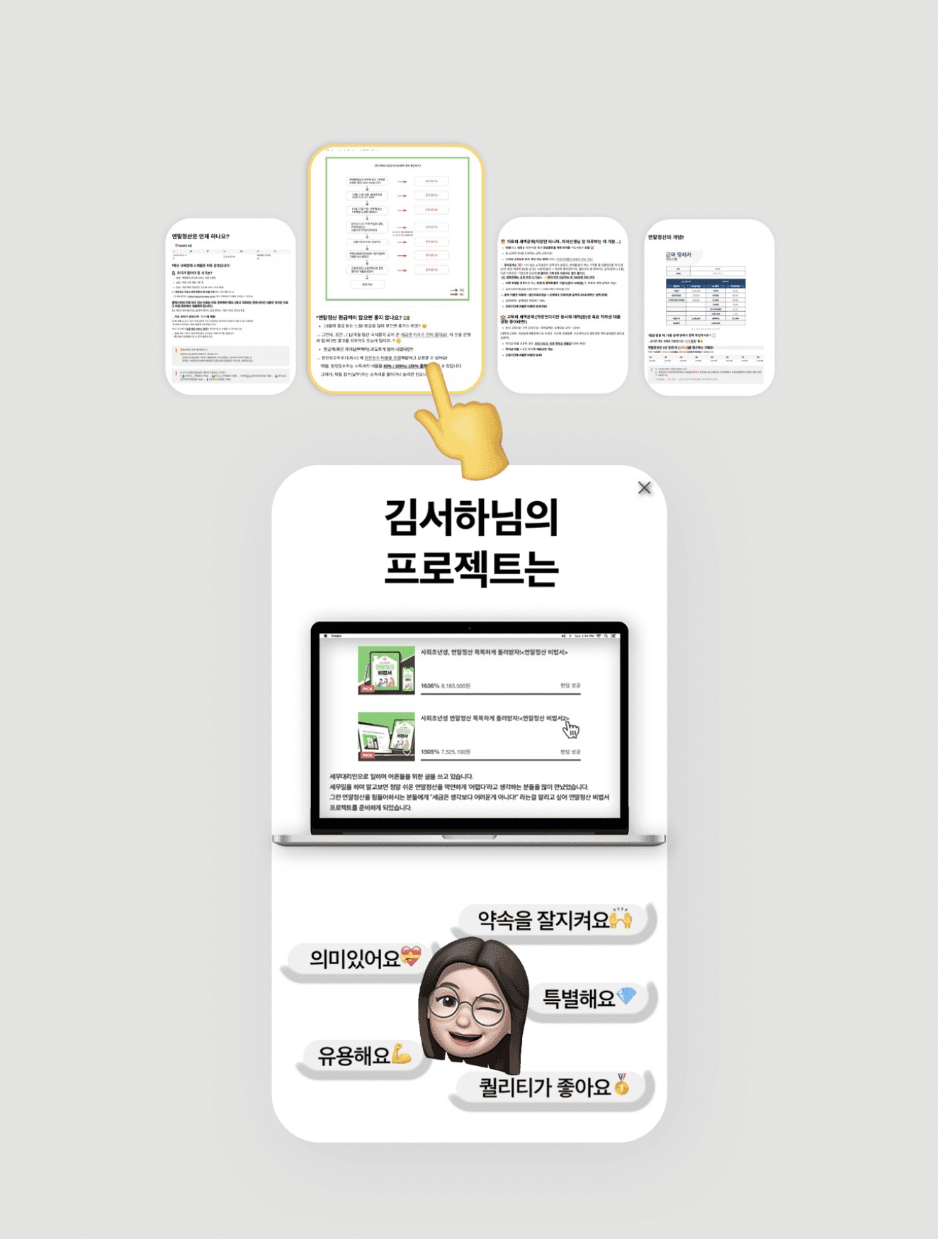
연말정산 비법서 Ver.3의 와디즈 펀딩 상세페이지를 기획하고 디자인했습니다. 이전 펀딩 기록과 후기부터 책의 구성과 부록까지, 후원 전에 확인할 내용을 순서대로 정리했습니다. I planned and designed the Wadiz campaign page for Year-End Tax Guide Ver.3. Previous campaign records and reviews lead into the book's contents and appendix, giving readers a preview before backing.
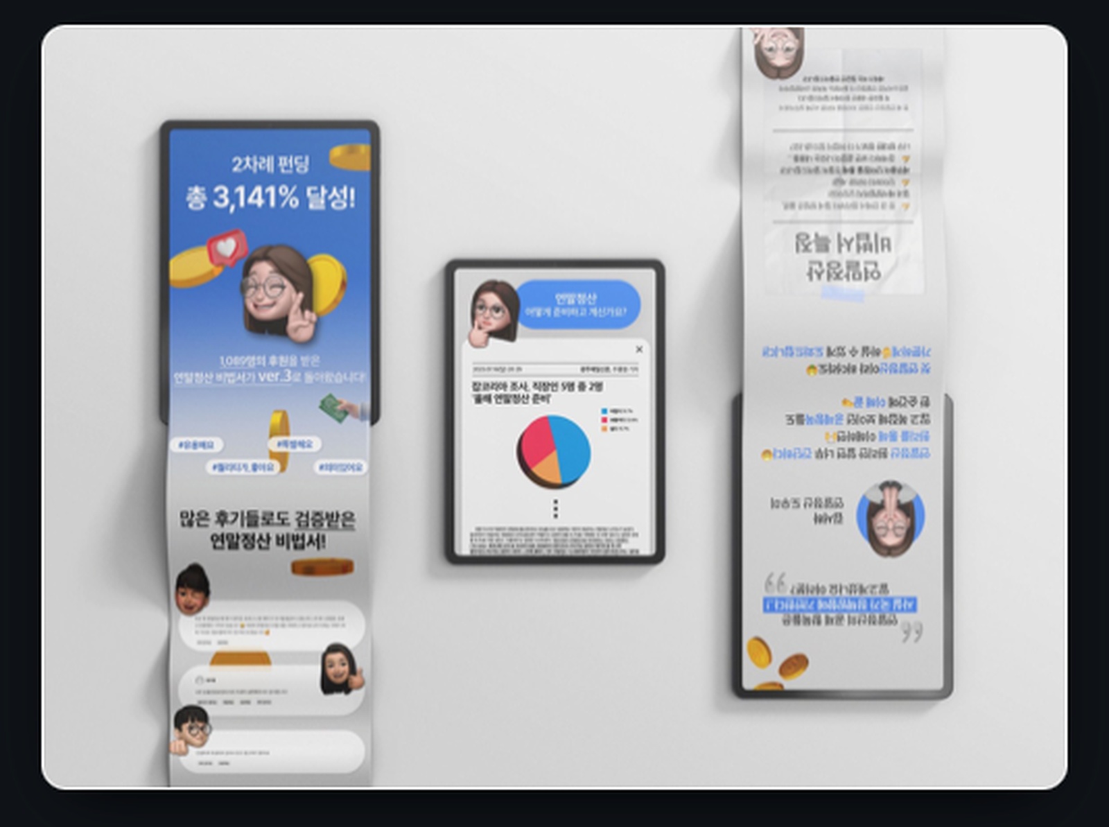
이전 펀딩 기록과 후기를 먼저 보여주고, 독자의 고민과 책의 내용, 리워드 안내로 이어지도록 구성했습니다. Previous campaign records and reviews come first, followed by reader questions, book contents and reward options.
이전 펀딩의 달성률과 후원자 수는 프로젝트 이력을 보여주는 자료로 배치했습니다. Ver.3의 개정 내용과 부록 안내는 별도 항목으로 구분했습니다. Earlier funding figures show the campaign history. Revision details and the appendix for Ver.3 are presented as separate items.
상세페이지에 소개한 이전 펀딩 기록입니다.A previous campaign figure presented on the detail page.
기존 후원자 수를 프로젝트 소개와 함께 배치했습니다.The earlier backer count accompanies the introduction.
새 버전에서 달라진 내용을 따로 보여줬습니다.Changes in the new edition appear separately.
본책과 부록의 구성을 구분해 소개했습니다.The main book and appendix are clearly distinguished.
책의 설명을 짧은 제목과 도식, 본문 예시로 나눴습니다. 문장만 이어지는 구간 사이에 캐릭터와 그래픽을 배치했습니다. The book description is divided into short headings, diagrams and sample pages. Characters and graphics break up longer passages.
설명 사이의 관계를 화살표와 박스로 연결했습니다.Arrows and boxes connect related ideas.
비교할 내용은 같은 형식의 카드에 나란히 배치했습니다.Comparable information appears in matching cards.
설명이 시작되는 지점과 질문 구간에 안내 캐릭터를 배치했습니다.The guide character appears at section openings and questions.
세무 용어를 설명하기 전에 설문 내용을 보여줬습니다. 수치와 질문을 함께 배치해 어떤 어려움을 다루는 책인지 소개했습니다. Survey figures and questions come before the tax terminology, introducing the difficulties the book addresses.
저자의 소개와 책을 만든 배경을 별도 구간에 담았습니다. 책의 구성 설명과 구분해 읽을 수 있도록 했습니다. The author's background and reasons for creating the book have their own section, separate from the contents.
짙은 배경과 밝은 글자를 바탕으로, 민트와 옐로를 수치와 강조 구간에 사용했습니다. Dark backgrounds and pale type form the base, with mint and yellow for figures and emphasis.