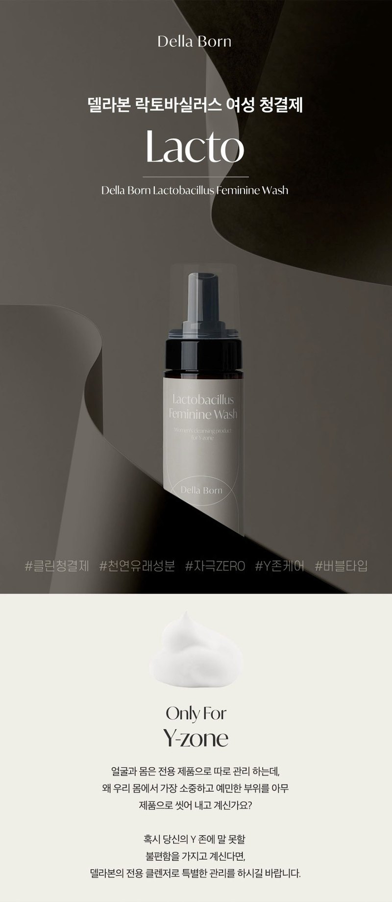
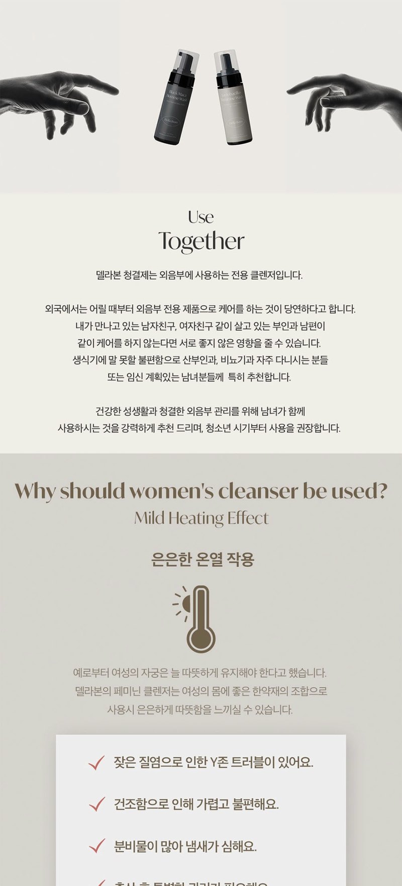
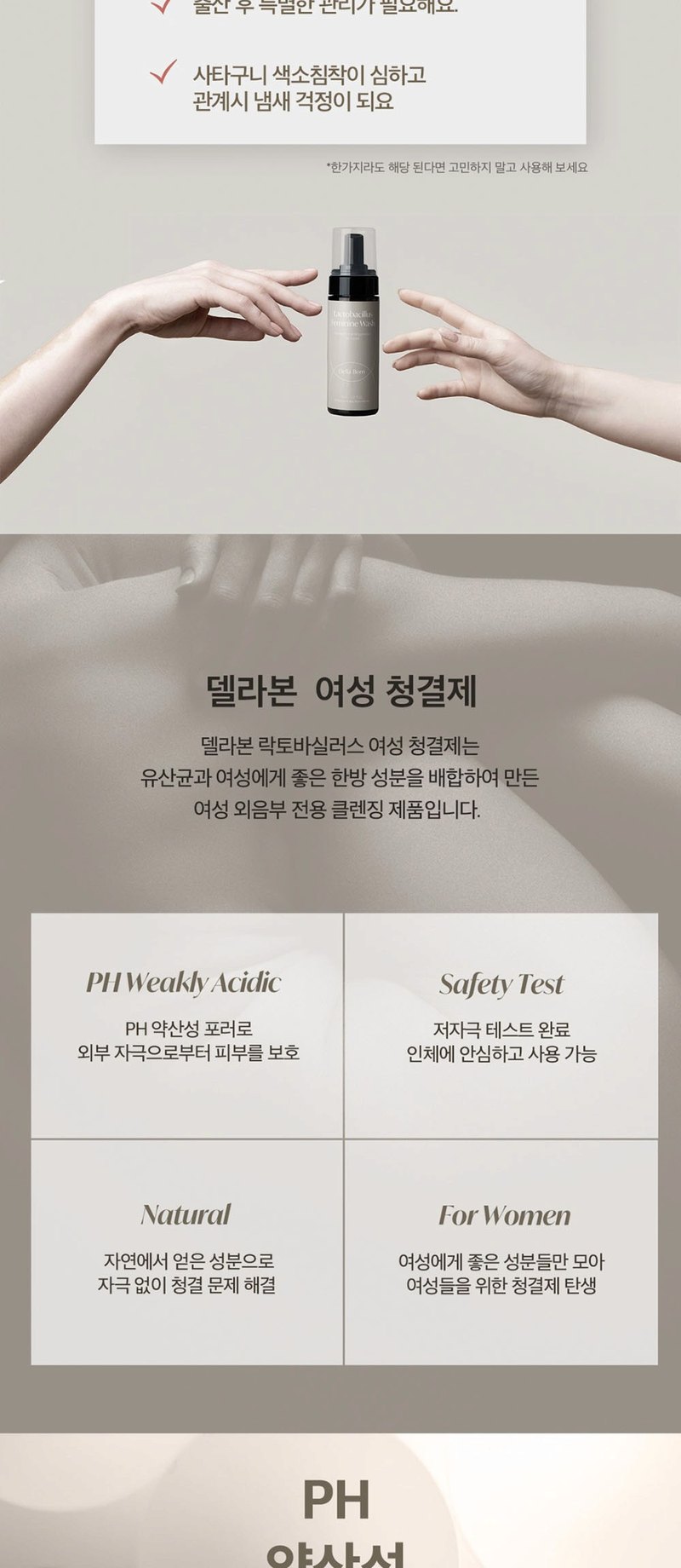
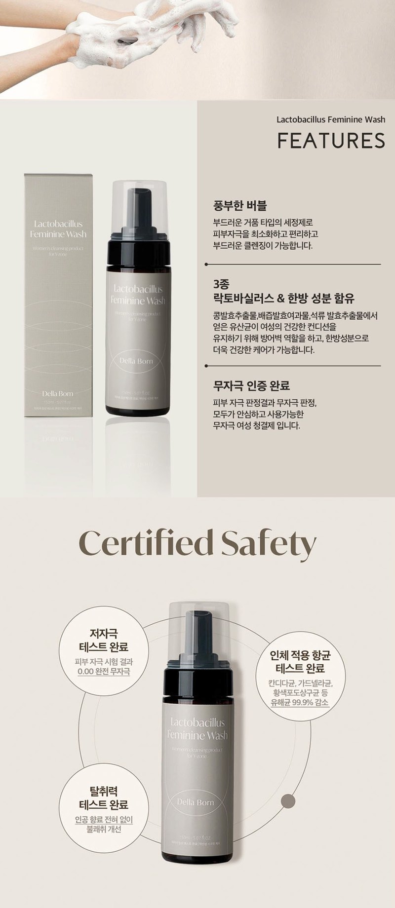
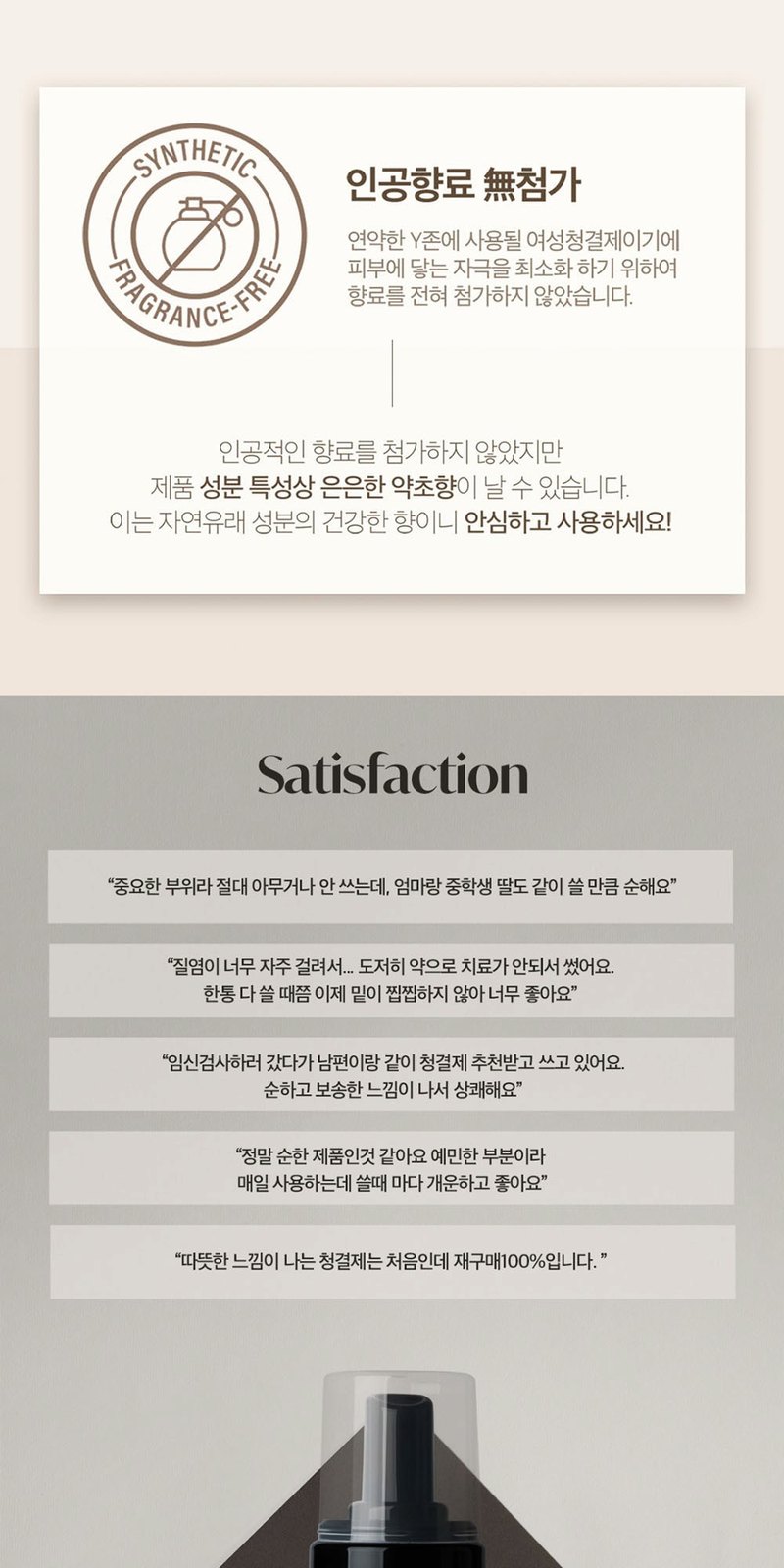
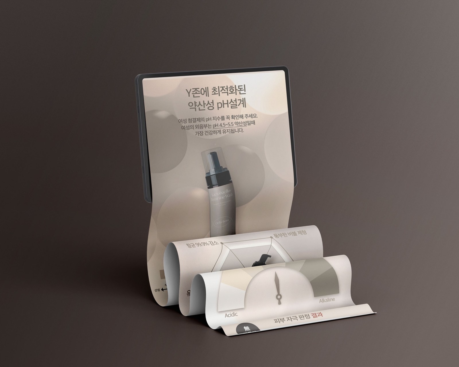
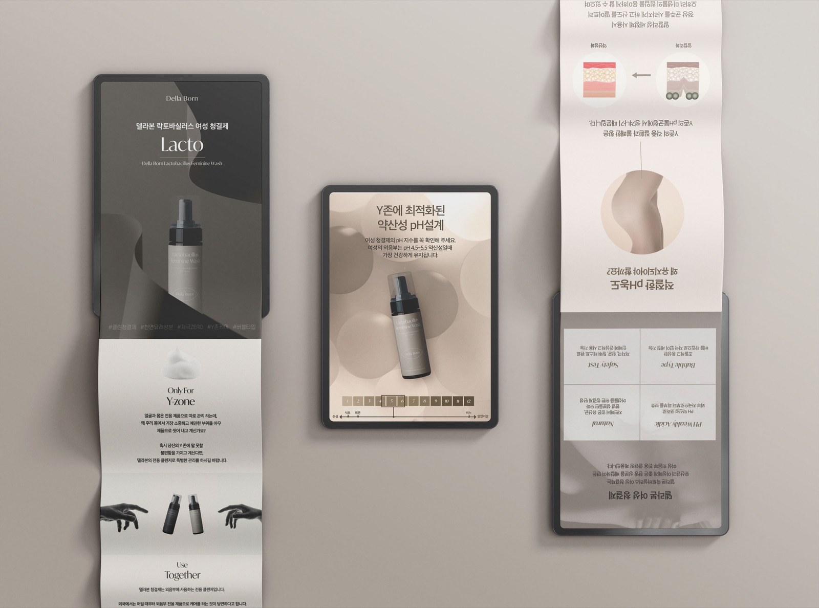
델라본 여성청결제의 상세페이지를 기획하고 디자인했습니다. 제품 소개 다음에 성분과 시험 자료를 배치하고, 거품 이미지와 사용 안내로 이어지도록 구성했습니다. I planned and designed the detail page for Della Born's feminine wash. The page moves from a product introduction to ingredients and test information, then foam images and usage guidance.
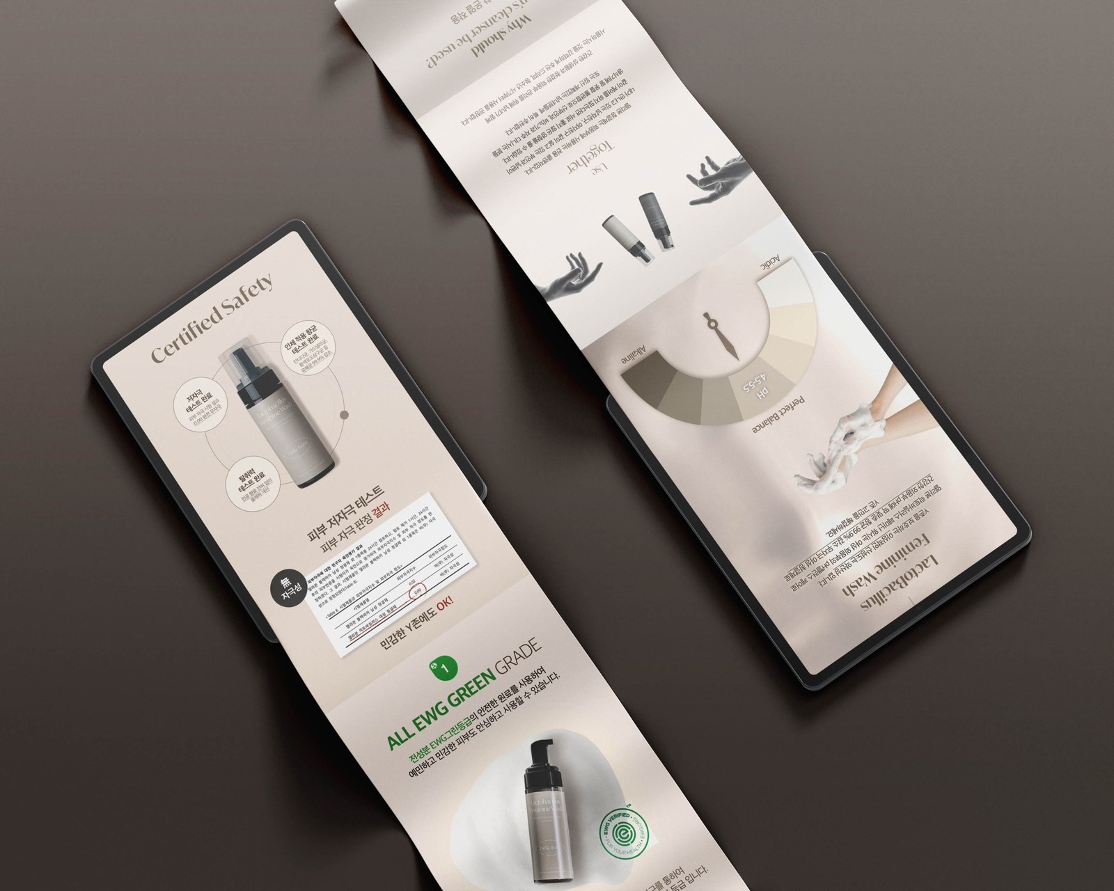
제품의 모습과 용도를 먼저 보여준 뒤, 성분·시험 자료·사용 안내를 순서대로 배치했습니다. The page introduces the product and its use before moving through ingredients, test information and usage guidance.
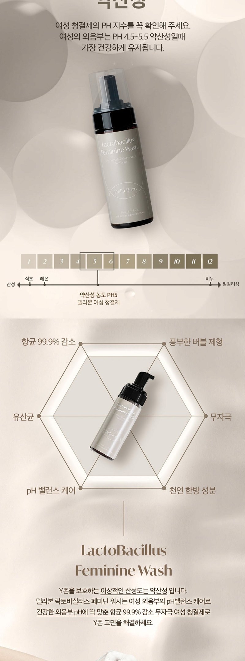
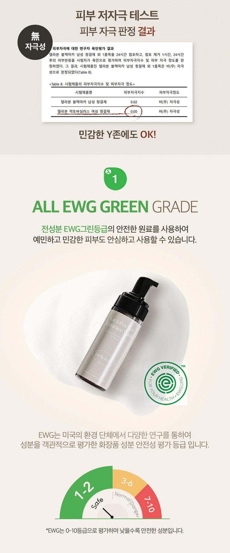
pH, 시험 결과, 성분 등급처럼 서로 다른 정보를 구분했습니다. 숫자를 크게 쓰되 무엇에 대한 수치인지 바로 옆에서 읽을 수 있게 했습니다. I separated pH, test results and ingredient ratings. Large figures are paired with labels explaining what each number refers to.
제품에 표기된 pH 수치와 설명을 함께 배치했습니다.The stated pH value is paired with its explanation.
제공된 시험 결과를 관련 설명과 묶어 보여줬습니다.The supplied result is grouped with the relevant description.
시험 결과 수치를 별도 항목으로 구분했습니다.The test figure is presented as a separate item.
제공된 성분 등급 정보를 성분 설명과 함께 정리했습니다.The supplied ratings appear with the ingredient descriptions.
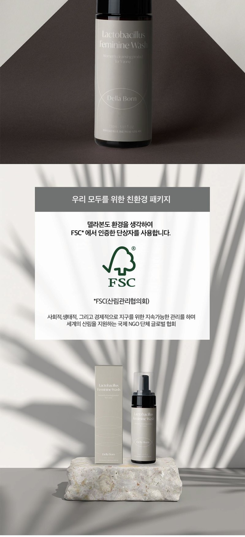
보틀 전체 컷과 거품의 질감이 보이는 확대 컷을 나눠 배치했습니다. 제품의 모습과 제형을 각각 살펴볼 수 있도록 했습니다. Full bottle images and foam close-ups are shown separately so readers can see the packaging and texture.
거품의 결이 보이는 이미지를 크게 배치했습니다. 짧은 설명을 곁들여 제형 소개 구간으로 사용했습니다.A large foam image with a short caption forms the texture section.
보틀과 주변 소품을 보여주는 컷은 제품 소개 구간에 배치했습니다.The bottle and props appear in the product introduction.
시험 자료, 제품 이미지, 사용 안내가 섞이지 않도록 각 구간의 역할을 나눴습니다. Each section has a distinct role, separating test information, product images and usage guidance.
시험 수치만 크게 보이지 않도록 항목명과 설명을 가까이 배치했습니다.Labels and explanations sit close to the test figures.
제목과 본문의 크기를 구분하고, 긴 설명은 짧은 문단으로 나눴습니다.Headings and body copy use distinct sizes, and longer explanations are split into short paragraphs.
보틀 이미지와 어울리는 로즈 계열과 아이보리를 중심으로 화면을 정리했습니다.Rose tones and ivory connect the layout to the bottle images.
로즈 계열과 아이보리를 바탕으로, 짙은 색을 제목과 본문에 사용했습니다. Rose tones and ivory form the base, with darker colours for headings and body copy.