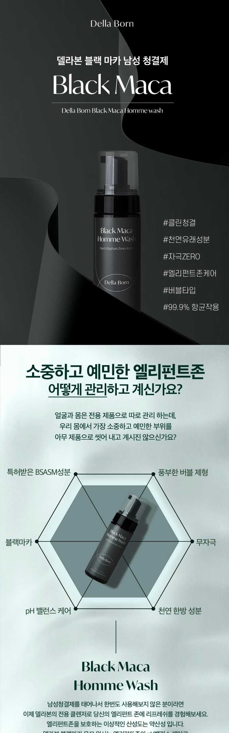
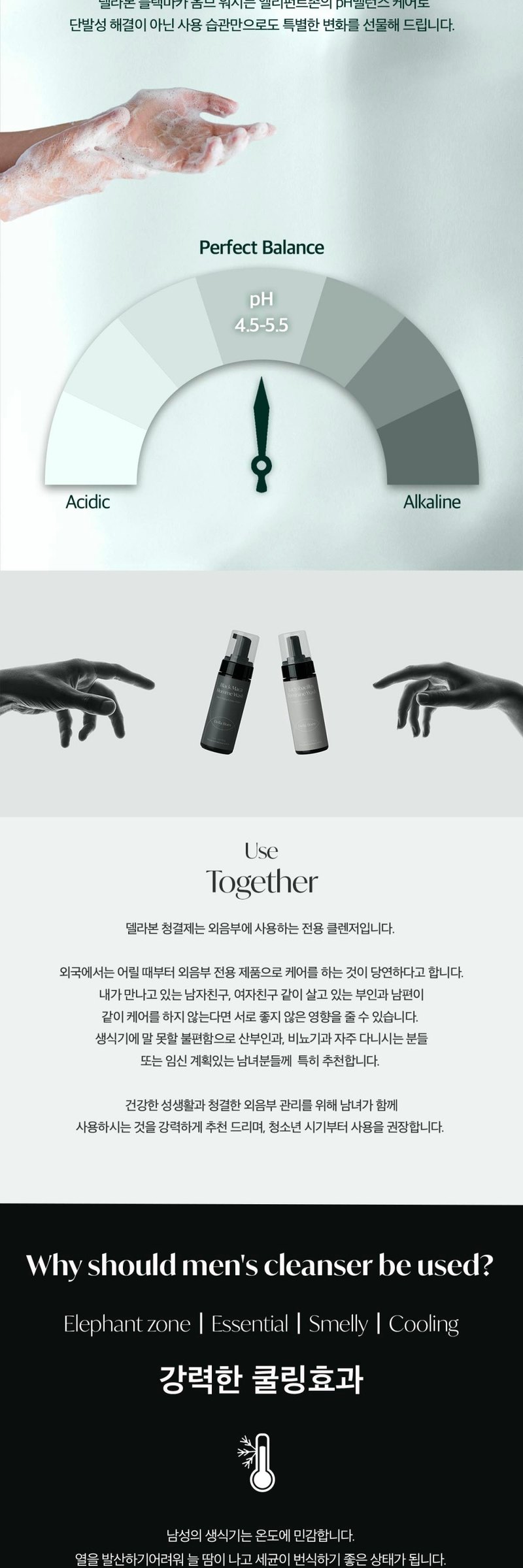
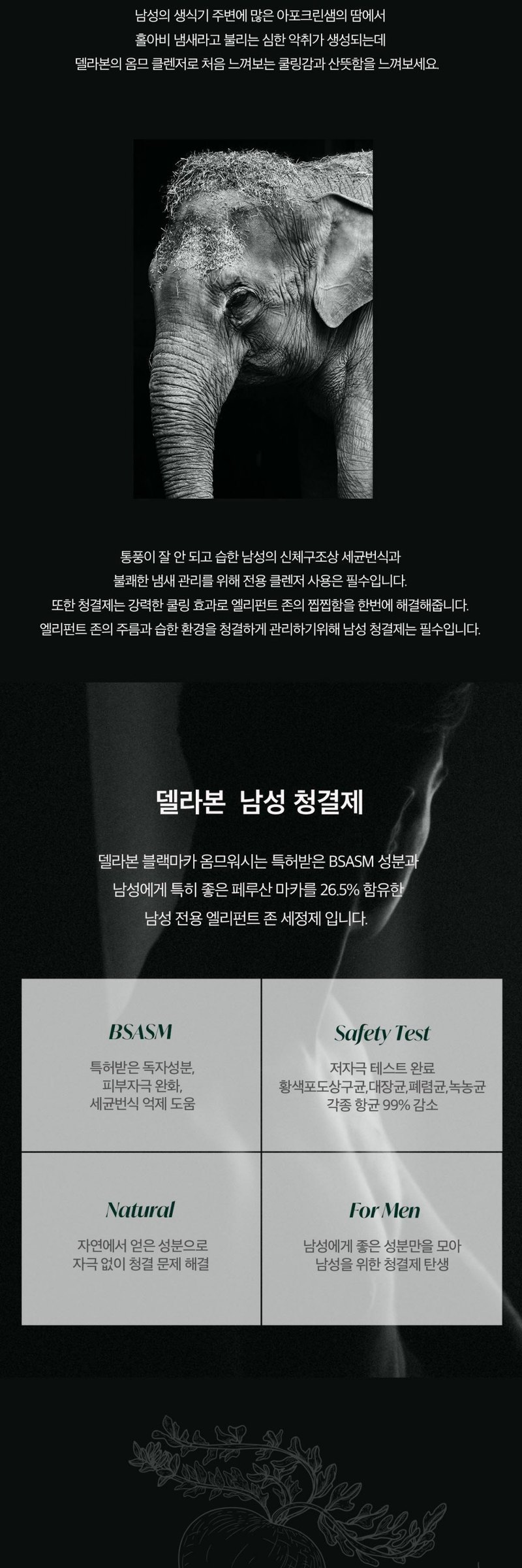
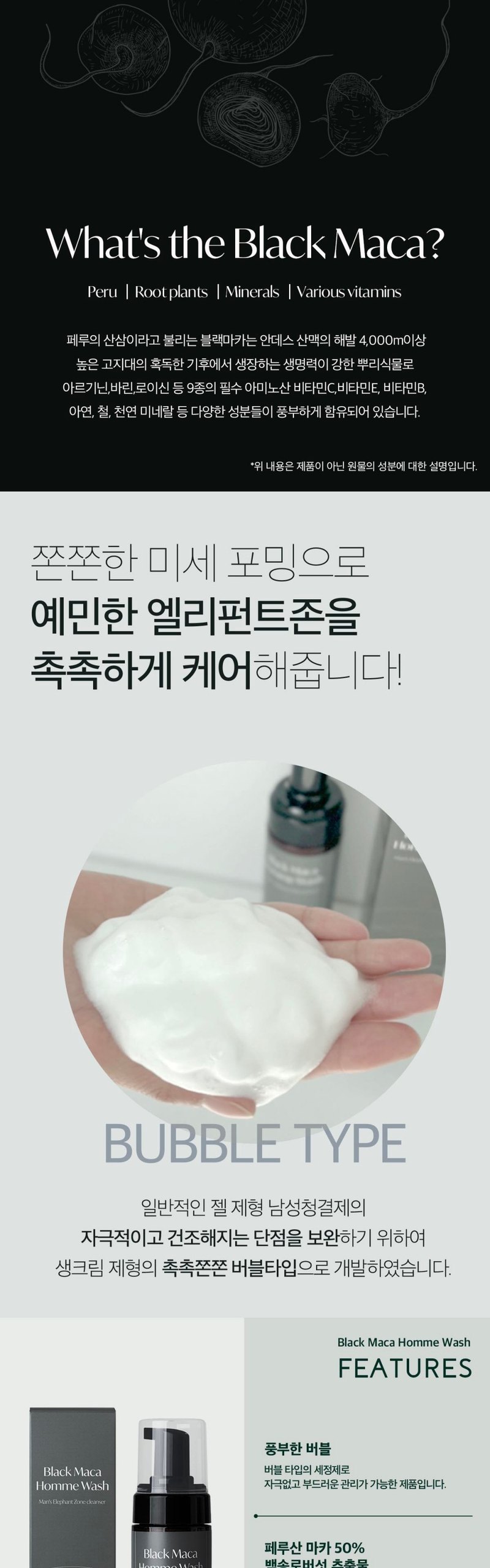
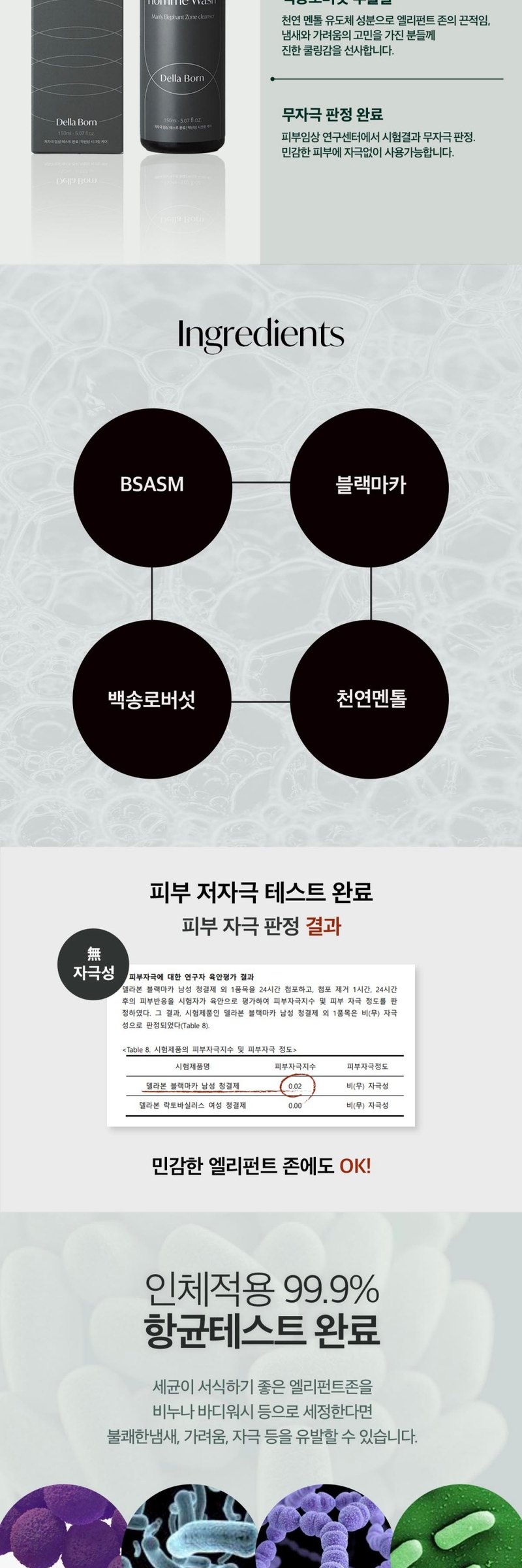
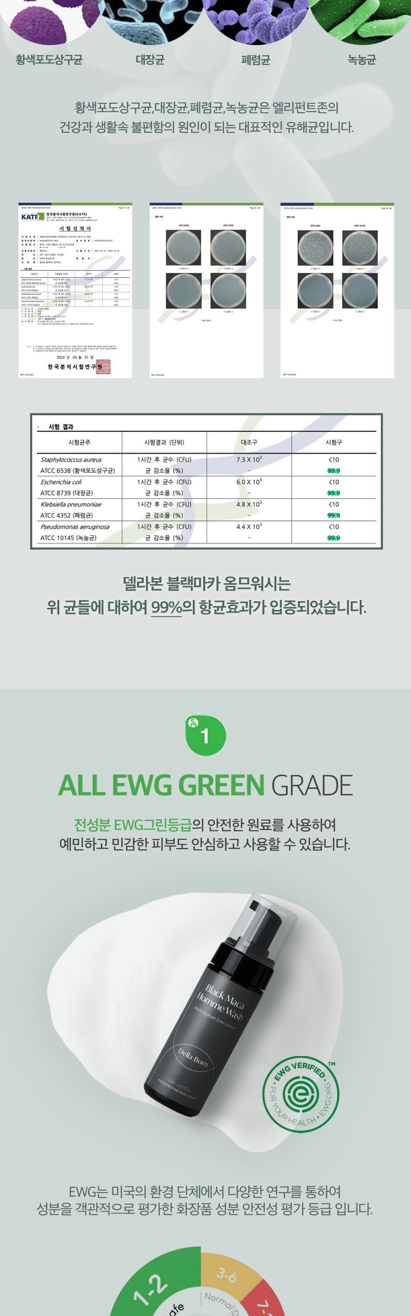
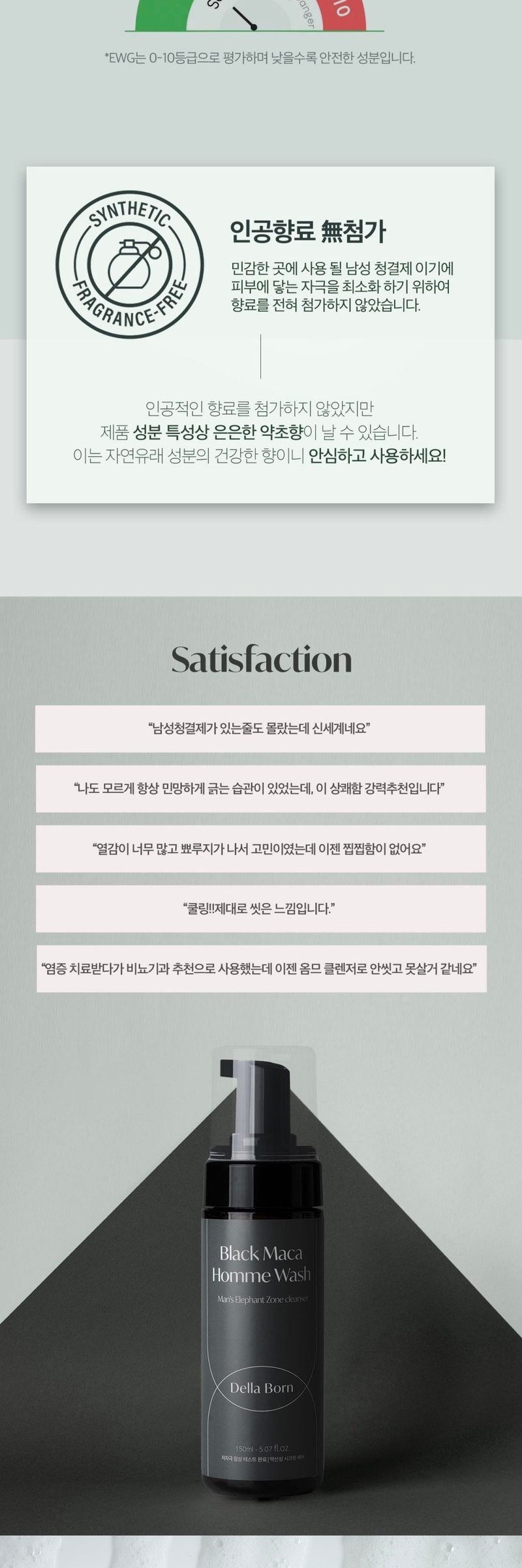
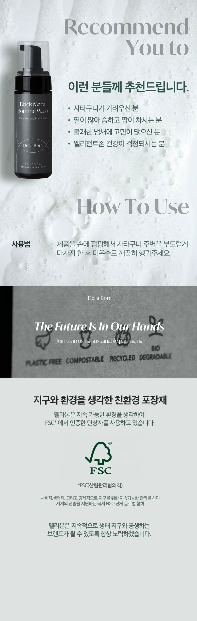
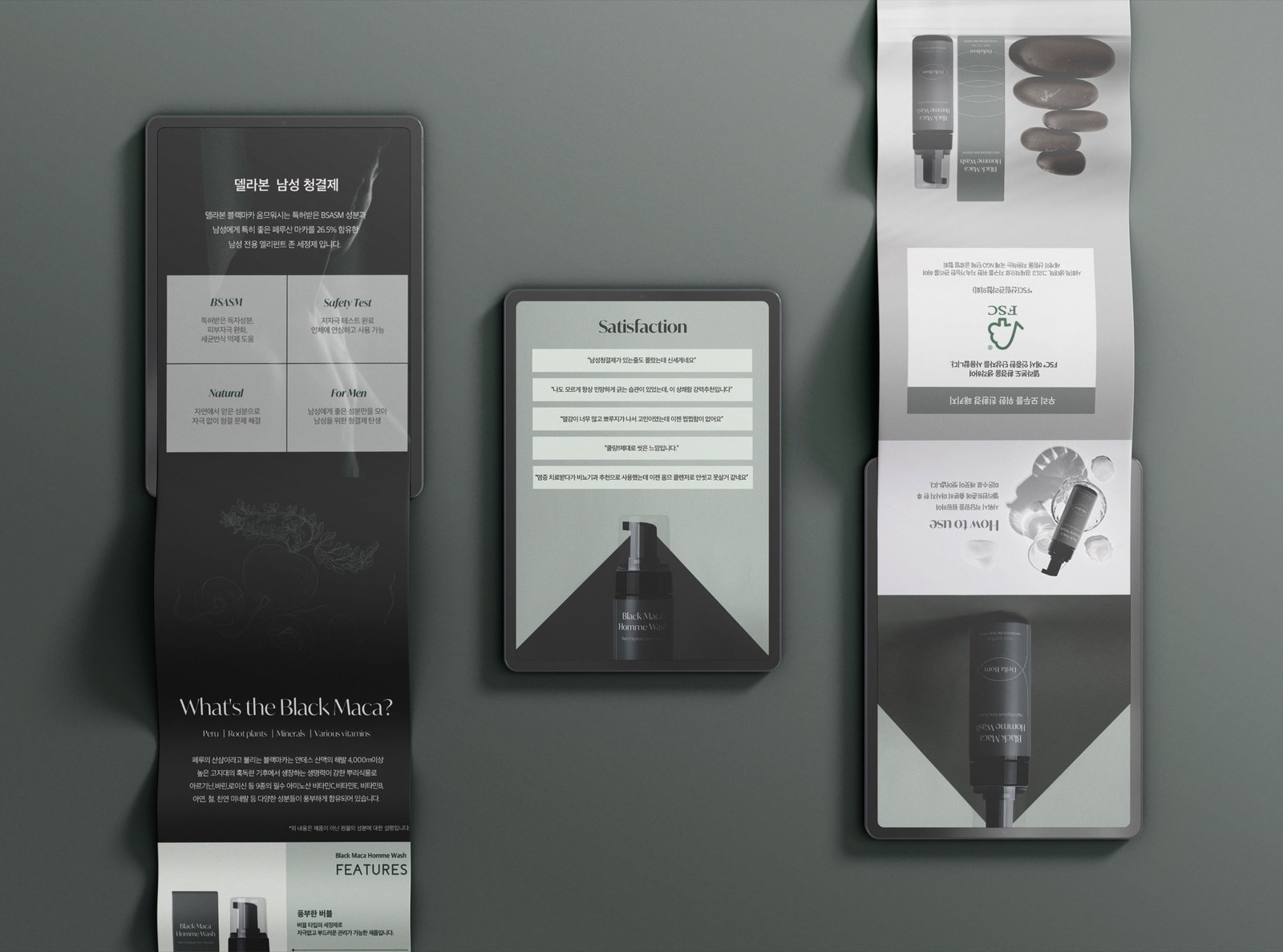
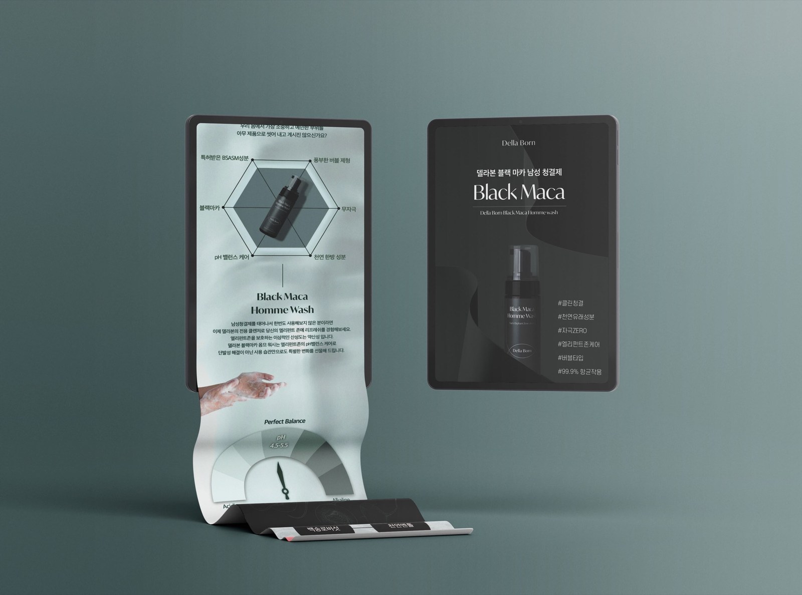
델라본 남성청결제의 상세페이지를 기획하고 디자인했습니다. 어두운 배경에 제품과 주요 수치를 배치하고, 성분·시험 자료·사용법을 차례로 읽을 수 있게 구성했습니다. I planned and designed the detail page for Della Born's men's wash. Product images and key figures sit against a dark background, followed by ingredients, test information and usage guidance.
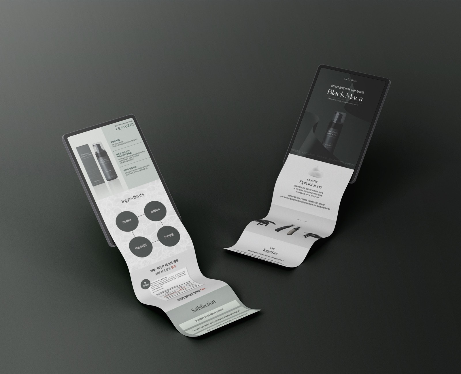
제품 소개에서 시작해 사용 부위, 성분과 시험 자료, 제형, 후기 순서로 이어집니다. The page moves from the product introduction to intended use, ingredients and tests, texture, and reviews.
함량, 원료명, 시험 결과, 사용감 설명을 각각 다른 항목으로 구분했습니다. 숫자와 짧은 제목을 먼저 보고 관련 설명을 이어 읽도록 배치했습니다. Content percentage, ingredient names, test results and texture descriptions are presented as separate items. Figures and short headings lead into the related copy.
제공된 자료의 함량 수치를 크게 쓰고 원료명을 함께 표기했습니다.The supplied percentage is paired with the ingredient name.
원료명과 관련 설명을 한 카드에 묶었습니다.The ingredient name and its description share one card.
시험 수치와 항목명을 함께 배치했습니다.The test figure appears alongside its label.
사용감에 대한 설명은 시험 수치와 구분해 보여줬습니다.Texture descriptions are separated from test results.
어두운 배경 위에 보틀과 밝은 거품 이미지를 배치했습니다. 제품의 윤곽과 거품의 질감이 배경에 묻히지 않도록 대비를 줬습니다. The bottle and pale foam images sit against dark backgrounds, keeping their shape and texture visible.
배경과 제품 이미지의 밝기를 구분해 보틀의 형태가 보이도록 했습니다.Brightness contrast helps define the bottle's shape.
거품 확대 이미지를 제형 설명과 함께 배치했습니다.Foam close-ups accompany the texture description.
첫 화면에는 제품 소개를, 아래에는 성분과 시험 자료를 나눠 배치했습니다. The opening introduces the product, with ingredients and test information in the sections below.
첫 화면의 제목을 짧게 두고 보틀 이미지를 크게 보여줬습니다.The opening uses a short heading and a large bottle image.
사용 부위 설명 다음에 성분과 시험 자료를 배치했습니다.Ingredients and test information follow the intended-use section.
차콜 배경과 밝은 글자, 블루 포인트로 각 구간을 구분했습니다.Charcoal backgrounds, pale type and blue accents distinguish the sections.
차콜과 블랙을 바탕으로, 밝은 거품 이미지와 블루 계열을 대비시켰습니다. Charcoal and black contrast with pale foam images and blue accents.